
XDubai Brand Refresh
Context & Brief
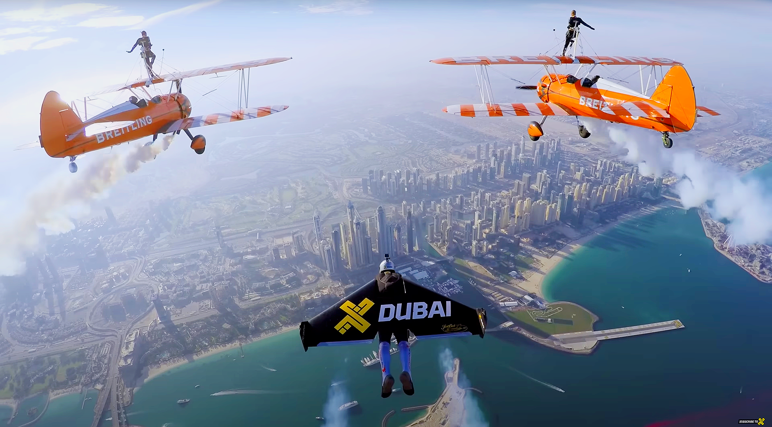
XDubai is the brand behind some of Dubai’s most adrenaline-fueled experiences: from XLine Dubai Marina, the world’s longest urban zipline, to XPark, its skate and parkour space, XPark Jr, a nature-inspired kids’ adventure park, MX Ride desert motocross, and branded shops and merchandise.
The brand also made its name through special projects and partnerships: from human flight stunts with jet-powered wings to headline collaborations with Red Bull and Skydive Dubai. These larger-than-life moments reinforced XDubai’s DNA of risk-taking and adventure, but over time the brand’s visual identity became fragmented and inconsistent, with each asset or activation presented differently; there was no clear system holding everything together.
The brief was to deliver a refreshed brand visual identity and design system that drives clear, concise, and consistent comms for XDubai and its assets.
What we did…
1) Logo Refresh
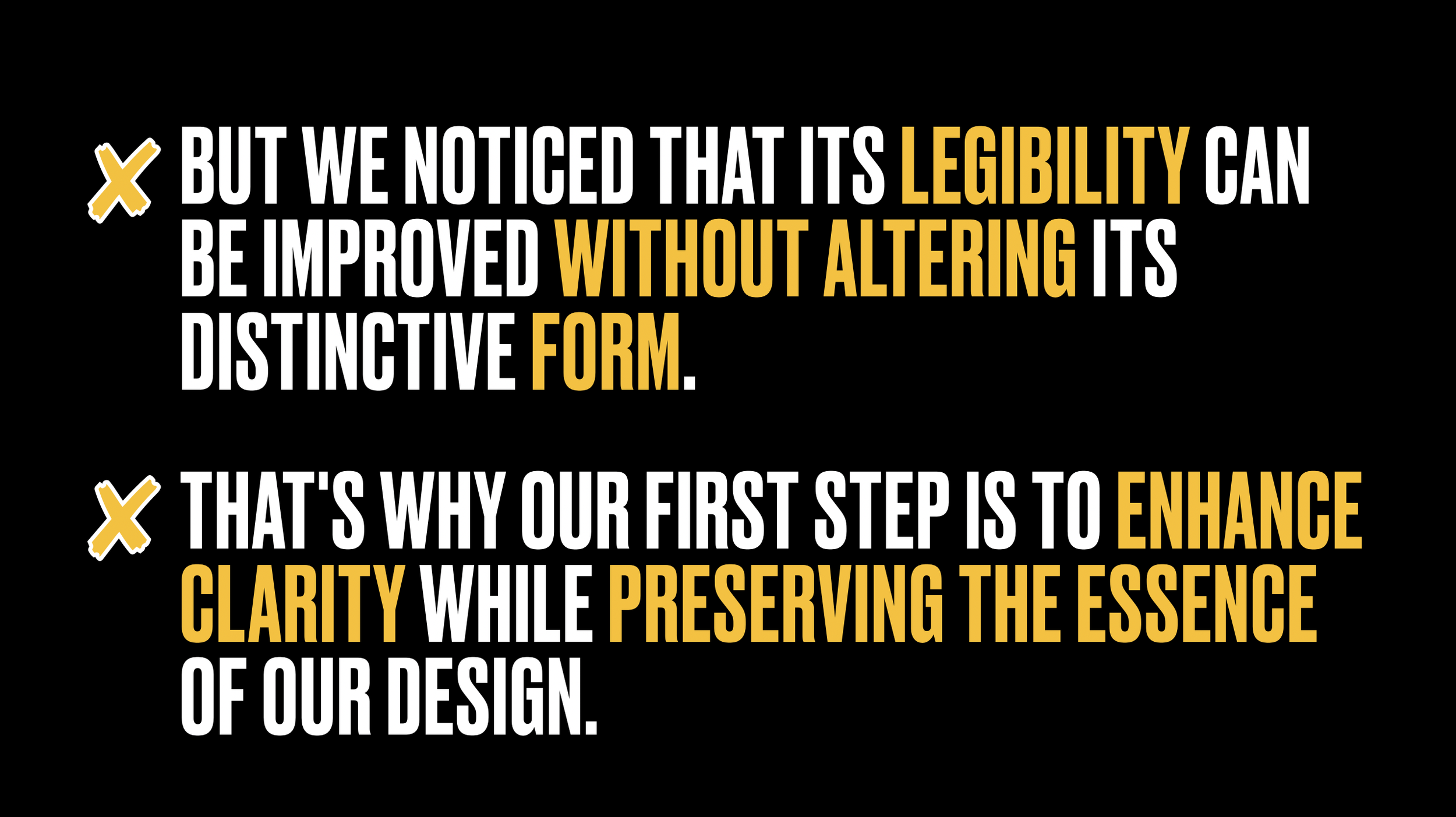
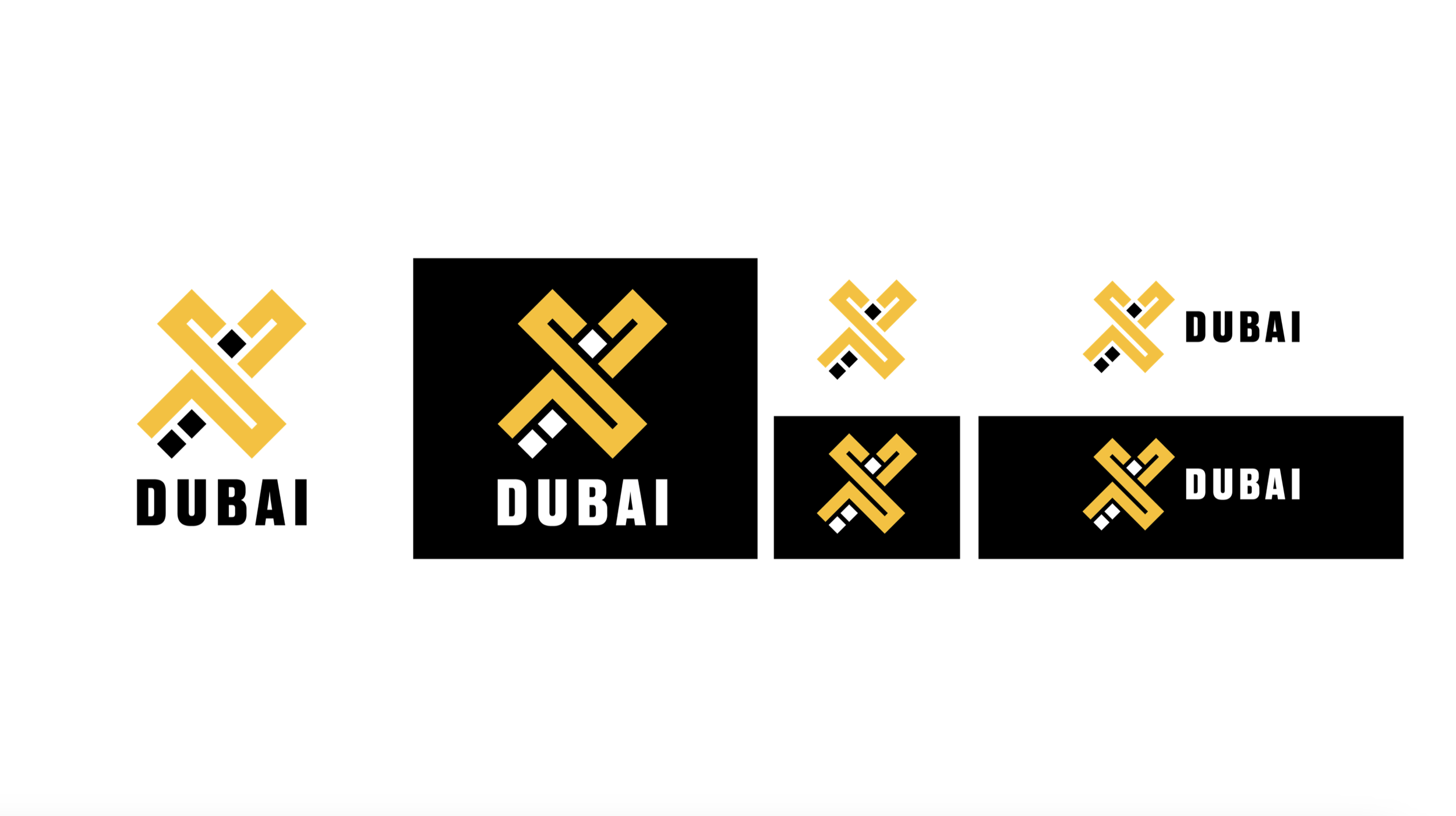
Enhanced the clarity and legibility of the “X,” simplifying accents and removing borders while preserving its iconic form.
2) Design System
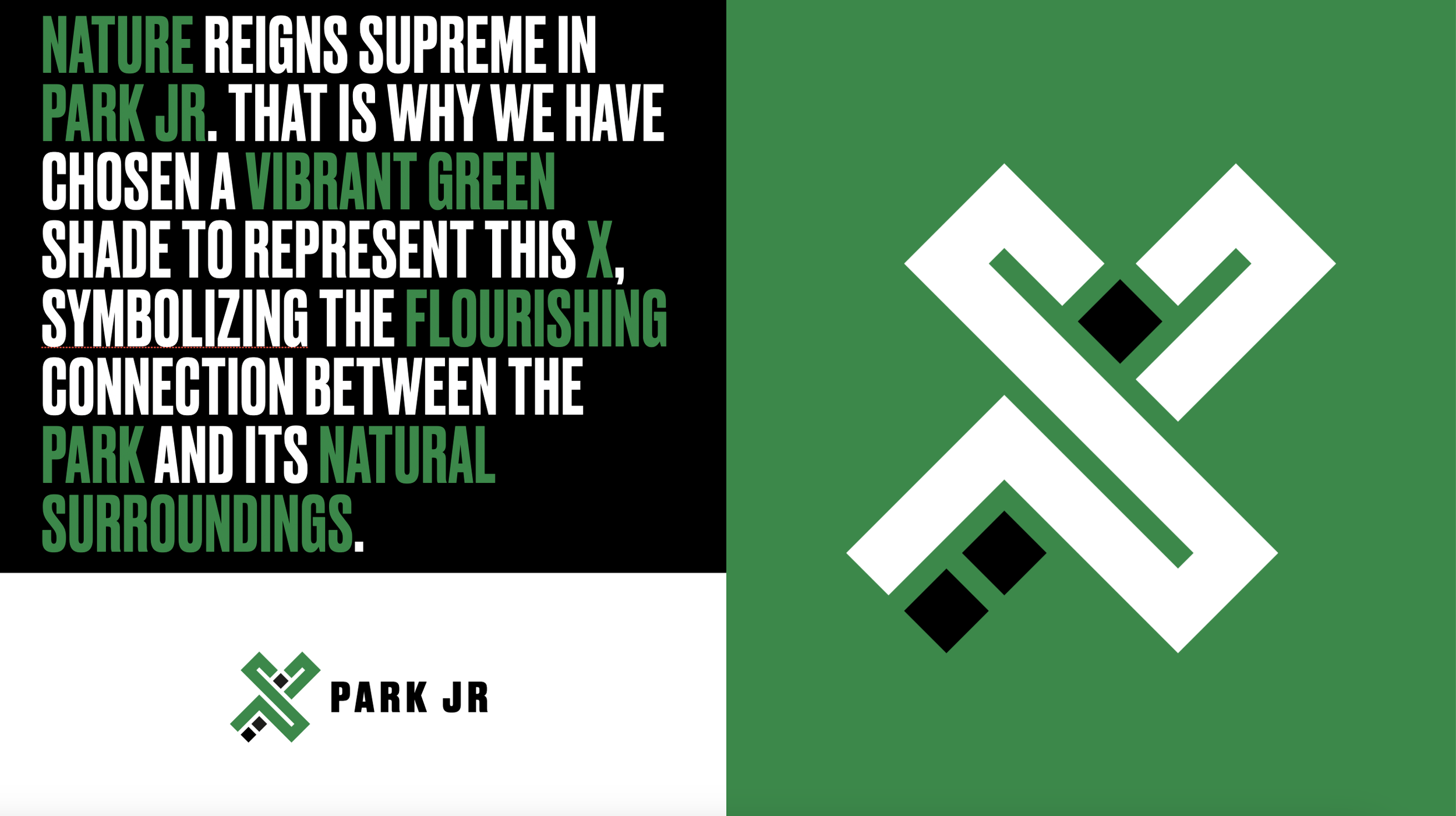
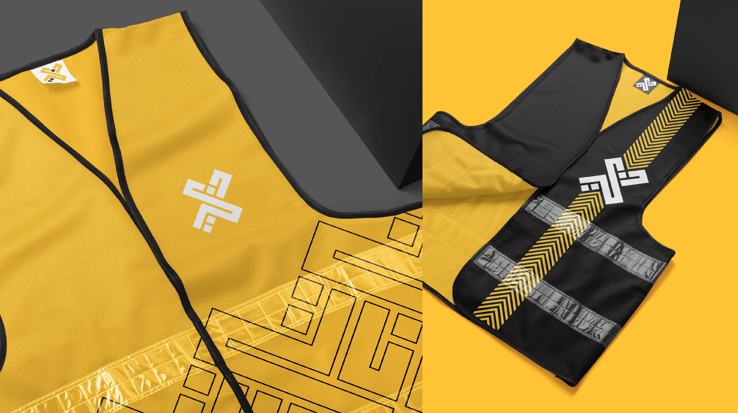
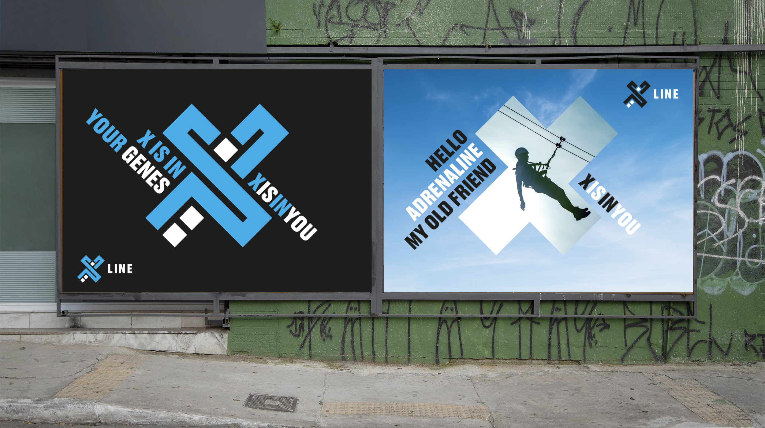
Created a structured visual identity, with colour-coded assets (yellow for XDubai, blue for XLine, red for XPark, green for XPark Jr, orange for MX Ride).
3) Typography and Look & Feel
Introduced bold type (Druk), an imagery style focused on risk-taking, and a tone of voice that invited adventure.
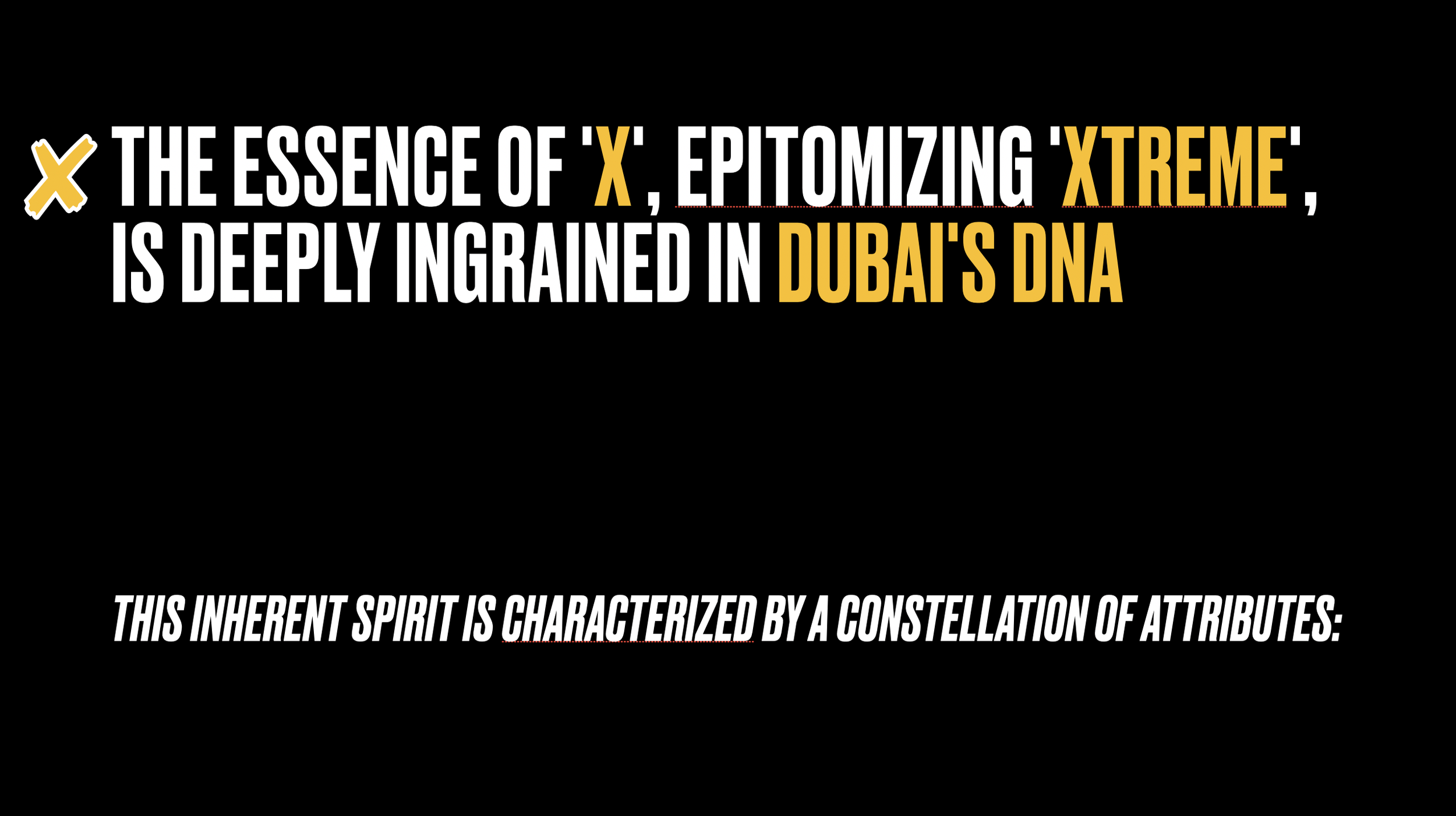
4) Narrative & Manifesto
Positioned the “X” as more than a letter — a symbol of possibility and identity that connects the brand to Dubai and its audiences.
THE BRAND REFRESH
THE BRAND REFRESH
Setting the scene with the narrative and comms strategy focusing on the DNA of the brand and of Dubai itself, even the rebrand presentation structure.


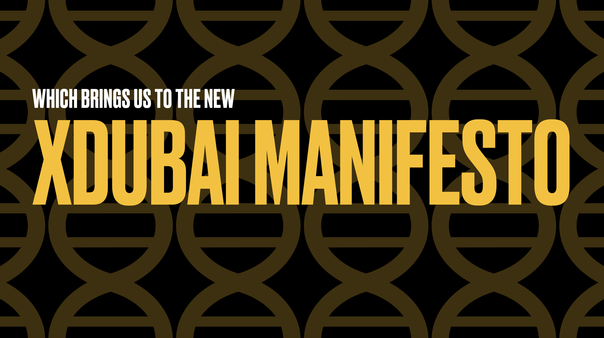
We elaborated further on the narrative with a manifesto that focused on X.


I spotted دبي engraved in the X of the brand’s logo…


Discovering the “X” in XDubai’s logo could also be read as Dubai in Arabic was the key realisation that unlocked the logo refresh below.

In our pursuit for better legibility, we also made the decision to remove the borders around the X.

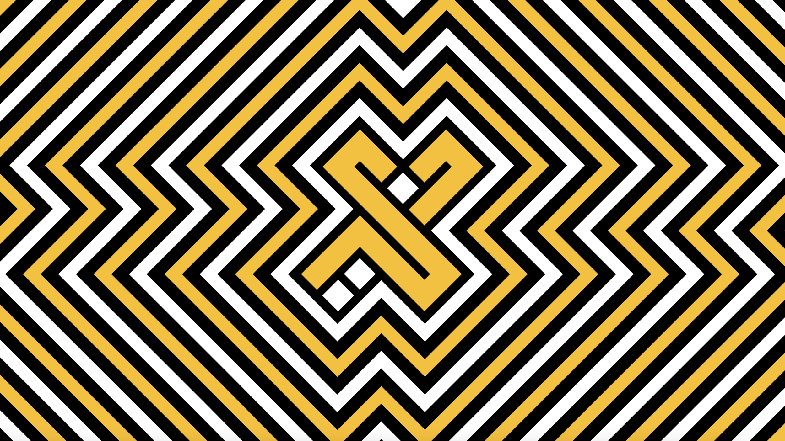
We pushed the limits in our shape, icon and pattern by placing the X at the heart of our communication and design system.


We created a unified design system by assigning a unique colour identity to each asset, distinguishing the brand’s different X’s.


Showcasing the new brand visual identity, design system and messaging on various OOH formats.


Applying the brand refresh to merch.


As the Strategic Lead, here’s what I did…
1) Spotted the Key Insight
Realized that the “X” in XDubai’s logo also reads as Dubai in Arabic, a discovery that became the anchor for the refresh.
2) Led the Strategic Alignment
Worked directly with the client to align on the objectives of the rebrand and ensure the refresh stayed true to XDubai’s DNA.
3) Briefed & Guided Creative
Provided the strategic brief to the creative team and collaborated closely on the design and narrative development.
4) Shaped the Narrative
Co-authored the deck and manifesto, crafting the story of the “X” as a symbol of ambition, adventure, and identity.
5) Integrated the Work
Ensured the refreshed logo, color-coded design system, and messaging connected seamlessly across XDubai’s diverse portfolio of assets and experiences.
6) Drove Client Buy-In
Built and delivered the full presentation deck, aligning strategy and design in a way that secured approval for the new identity.
Ask me about this project
ejamesfox@gmail.com
Phone
+971 585 808 661